Living brand book
Runwayz style guide
Every token, type style, and component — rendered live. Color rows show both modes side by side; everything else follows the current mode (toggle is in the footer). Built on the Art Deco v2 design tokens.
01
Logo
Full lockup, light and dark backgrounds.


02
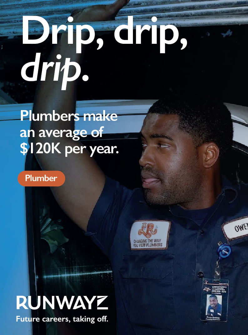
Vibe / posters
The brand in the wild: bold display headline (one word italicized), real trade photography, a single accent chip per composition, money-forward copy, and the Runwayz lockup.


03
Semantic color tokens
These swap automatically by mode. Left swatch = light, right = dark. All pass WCAG AA on the surfaces they appear on.
Page background
--bg-page · #FAF4E6 / #141A28
Surface (cards)
--bg-surface · #FFFFFF / #1B2232
Raised
--bg-raised · #FFFBF0 / #272D3C
Hero
--bg-hero · #F5ECD7 / #0C1018
Border
--border · #DDE0E7 / #272D3C
Text — primary
--fg1 · #1F2430 / #F5ECD7
Text — secondary
--fg2 · #4A5264 / #DDE0E7
Text — tertiary
--fg3 · #5F6678 / #8A92A3
Accent (interactive)
--accent · #14609F / #7DB8E4
Success
--success · #1F6C52 / #5CB394
Warning
--warning · #A86A10 / #F4A02C
Danger
--danger · #B63A2A / #E87666
04
Poster accents
Decorative accent colors for marketing and UI.
05
Typography
Gill Sans is the primary typeface across all brand communications — print, decks, signage, collateral. Cabin is the secondary, open-source substitute used on digital surfaces where Gill Sans can't be licensed for the web.
Primary · Gill Sans
Licensed (Monotype). The face for all brand & design communications. Renders below if Gill Sans is installed locally (e.g. macOS); otherwise it falls back to the web font.
Build something real.
Hard skills, soft life. Future careers, taking off.
Secondary · Cabin (web)
Open-source (OFL), humanist in the Gill Sans tradition — the live web font for this site. Weight tops out at 700, which handles display.
XL Headline · .headline-xl · homepage hero (3.375 → 4.5rem)
Find your path.
Display · 700 · -0.02em
Build something real.
Heading 1 · 700 · 2.7rem (3.6rem ≥sm)
Real work. Real pay.
Subheading · .subheading · 25px
Runwayz helps great careers take off, in the skilled trades and beyond.
Heading 2 · 700
The basics
Eyebrow · 700 · 0.16em · UPPER
Section 01
Body · 400 · 1.55
Plumbers make an average of $120K per year. Just saying.
06
Components
Built from the semantic tokens — try the footer toggle to see dark.
Buttons
Tags — flat, 4px radius, one accent each
Form inputs
We use this to prioritize jobs near you.
Zip must be 5 digits.
Status
07
Light / dark side by side
The same card composition in both modes.
light
For Talent
Find your next opportunity
Training, credentials, and jobs — surfaced through the people you trust.
dark
For Talent
Find your next opportunity
Training, credentials, and jobs — surfaced through the people you trust.
08
CMS body blocks
The exact set of blocks editors can insert in any rich-text body (blog posts, case studies, help articles, standard pages). Defined in sanity/schemas/blockContent.ts, rendered by components/PortableTextRenderer.tsx — both must change together.
- Text — paragraphs with bold / italic / underline and links; headings H2, H3, H4 (H1 is reserved for the page title); quote style; bullet and numbered lists.
- Image — full column width, rounded corners, with alt text and an optional caption.
- Pull Quote — large bordered quote with attribution, for editorial emphasis.
- Columns — 2 or 3 side-by-side columns of any body content; stacks vertically on mobile.
- Video — paste a YouTube or Vimeo URL for a responsive 16:9 embed with an optional caption.
- HubSpot Form — inline marketing form by form ID.
09
Page sections
The page-builder blocks for the Sections field on CMS standard pages, blog posts, and case studies (rendered full-width below the article body on the latter two). Editors add, fill, and reorder; layout and styling are fixed in components/SectionRenderer.tsx. Defined in sanity/schemas/sections.ts — schema, renderer, and this list must change together.
- Rich Text — a standard content section: optional eyebrow + H2, then body copy capped at 3xl width.
- Split (text + media) — text beside an image, image left or right, stacking on mobile.
- Feature Grid — 2 or 3 columns of surface cards, each with a title, short body, and optional image.
- Stat Band — up to 4 stat cards with an accent value and label.
- Logo Wall — a row of logos at uniform height, wrapping as needed.
- Quote — a standalone large quote with attribution.
- CTA Band — heading, optional body, and a centered accent button (CTA centering rule).